Branding Refresh & Website Development
Better Together Mental Health
Better Together Mental Health had been open and operating for several years before owner Beth Orns met Marie at a workshop in the fall of 2023. The practice had a logo, invested in professional photo/videography, and even had an existing Wix website. And yet, the business had grown significantly and these marketing essentials just didn’t feel “right” anymore. They didn’t convey the friendly, professional support the therapy office had come to be known for. Owner Beth Orns knew her business had evolved beyond its current branding and digital presence.
It was time for a refresh. Beth turned to Neat + Nimble for help in building a strong brand identity, digital presence, and off-line marketing materials.
Solutions
Logo Development and Brand Identity Guide
WordPress Website
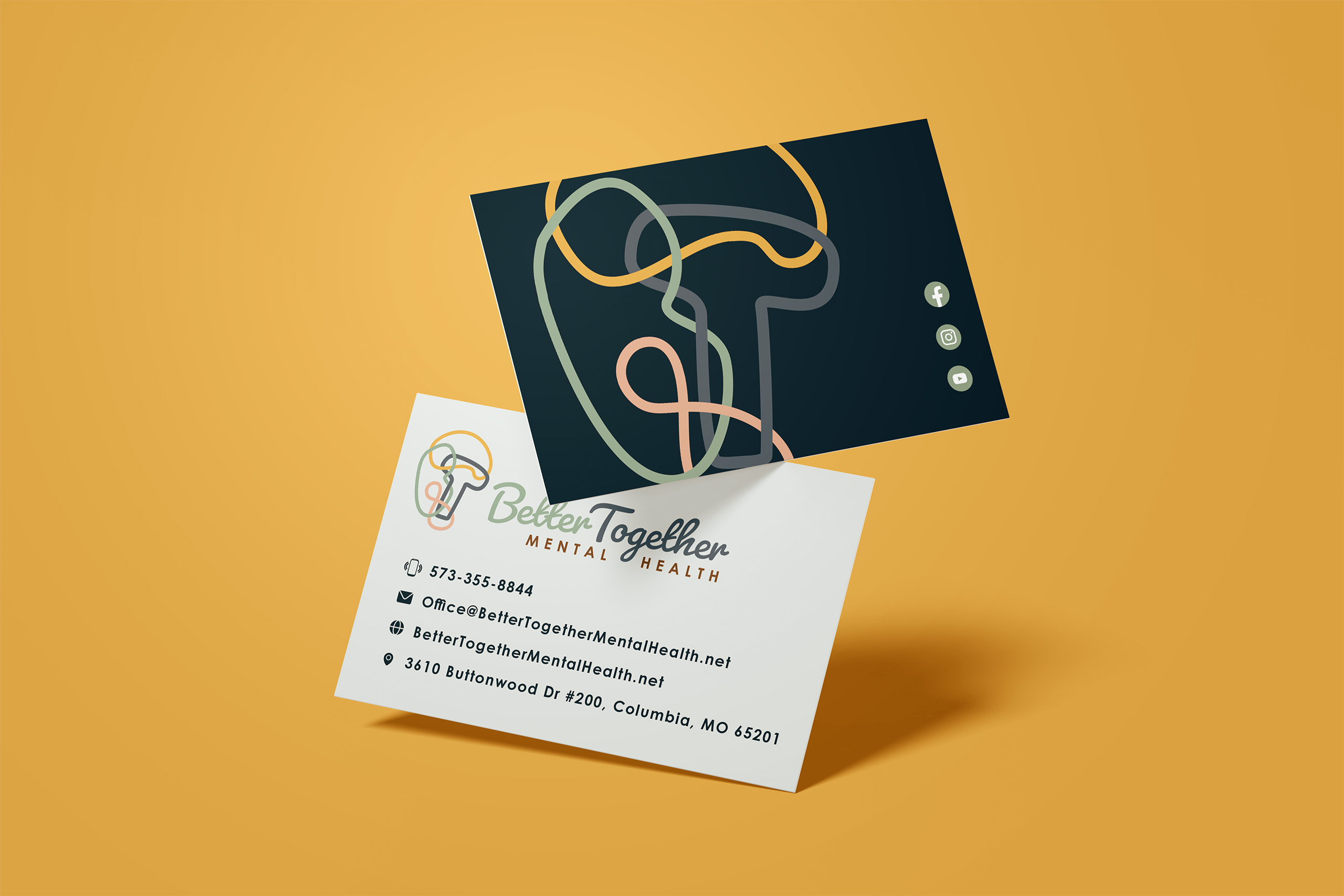
Business Cards
Rackcards
Email Signatures
Canva Templates
Brand Photography
Services
- Graphic Design
- Print/Press Management
- HTML Development
- Social Media Graphics
- Copywriting
- Digital Marketing
- WordPress Website Development
- Template Creation
Identity Refresh
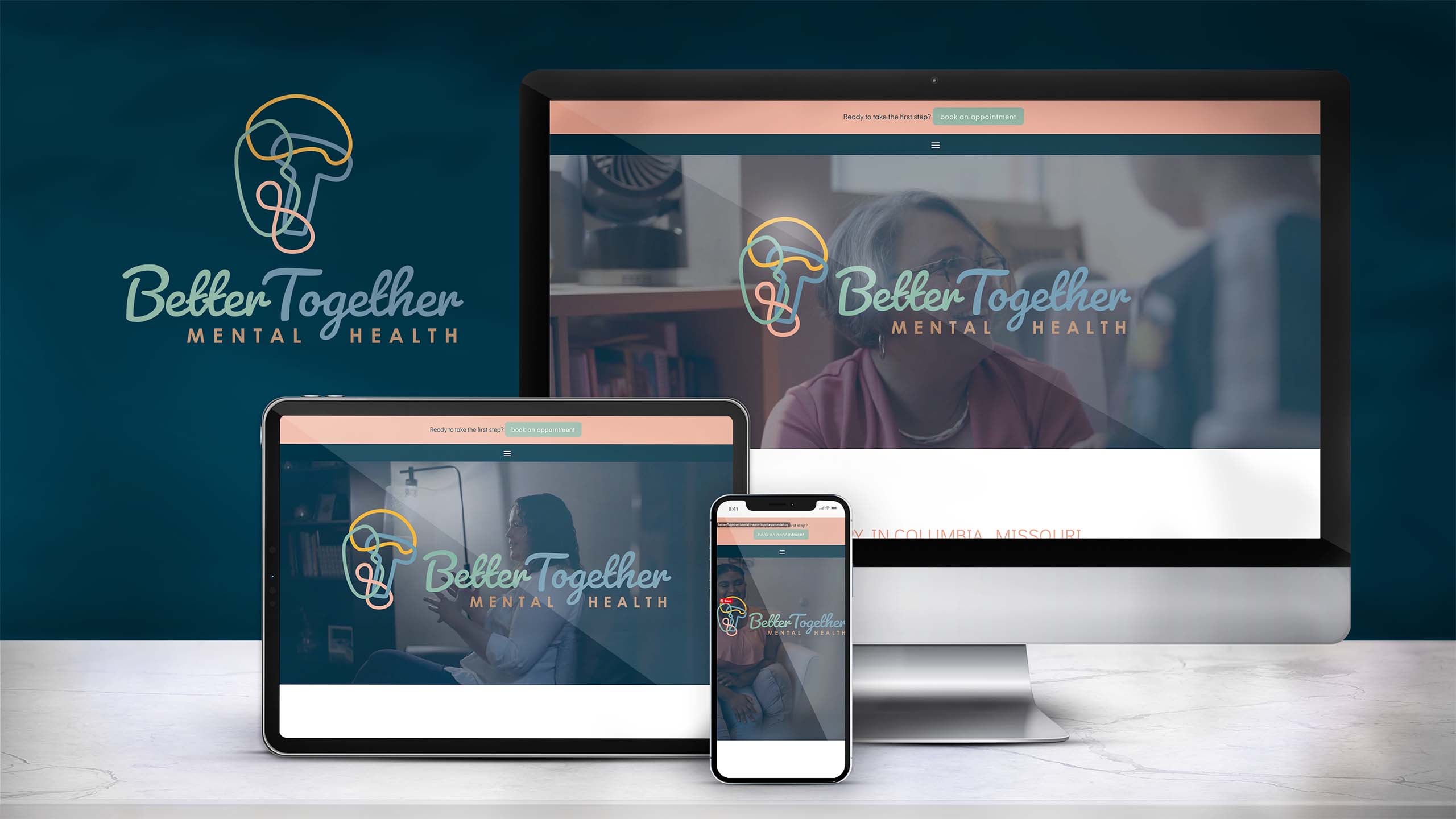
The Neat + Nimble team stepped in with a comprehensive solution. Through our Brand + Build package, we transformed Better Together Mental Health’s brand identity into the next level evolution. We began by developing a custom logo design that encapsulated the essence of the practice. The entangled B and T letters combined with the brain shape represent the complex and intertwined thoughts we all have sometimes. The eternity symbol represents a constant state of evolution and self-improvement their ideal clients seek. This was complemented by a carefully curated color palette and brand identity guide to ensure consistency across all touchpoints.
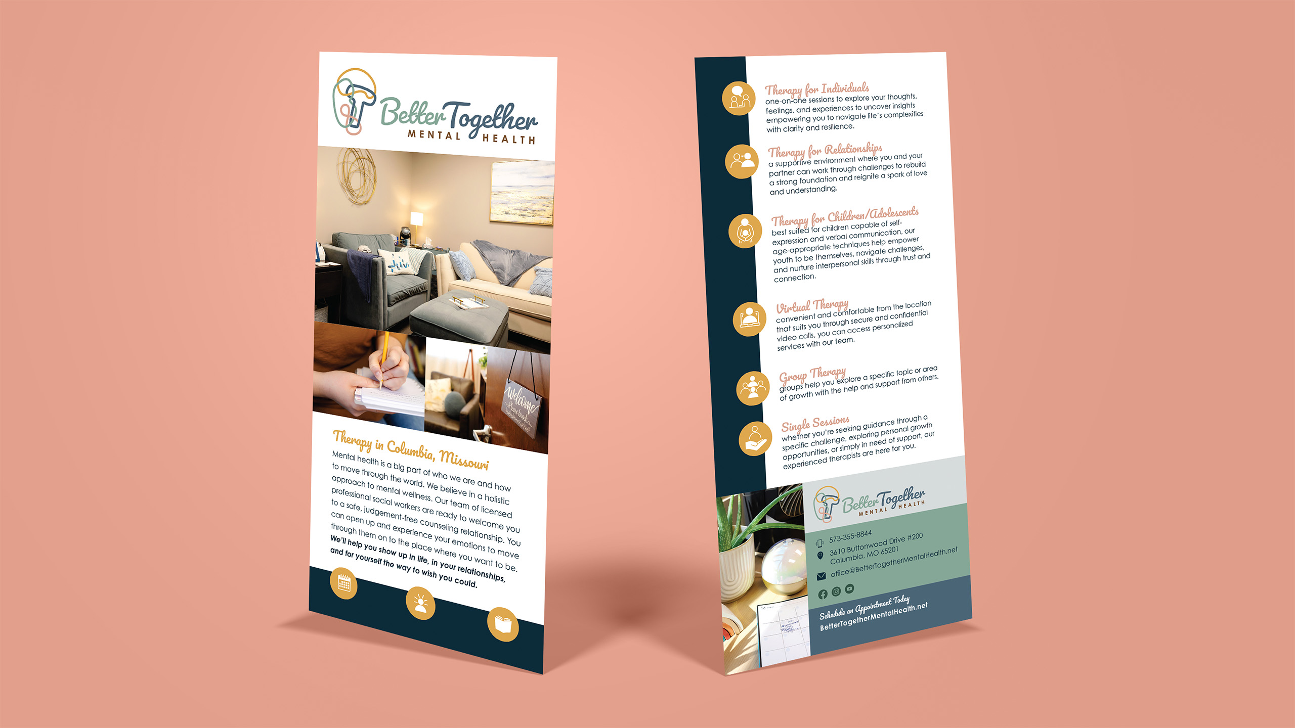
“After searching extensively for a company to work with to develop our website and branding we knew the search was over once we met Marie at Neat & Nimble. Marie truly took the time to understand our needs and the identity we wanted to present. She was a collaborative partner in the development process who made it easy to have honest conversations along the way leading to an end product that everyone is proud of. Marie delivers on deadlines and has a clear process in place to ensure work is completed as promised. Our new website immediately increased our SEO and new client inquiries helping our practice grow. The rack cards and business cards are consistently well received and stand out from others in our field due to their high level of quality and creativity. I look forward to continuing to work with Marie on our branding and maintenance of our website and marketing materials.”
-Beth Orns


Curating Their Story
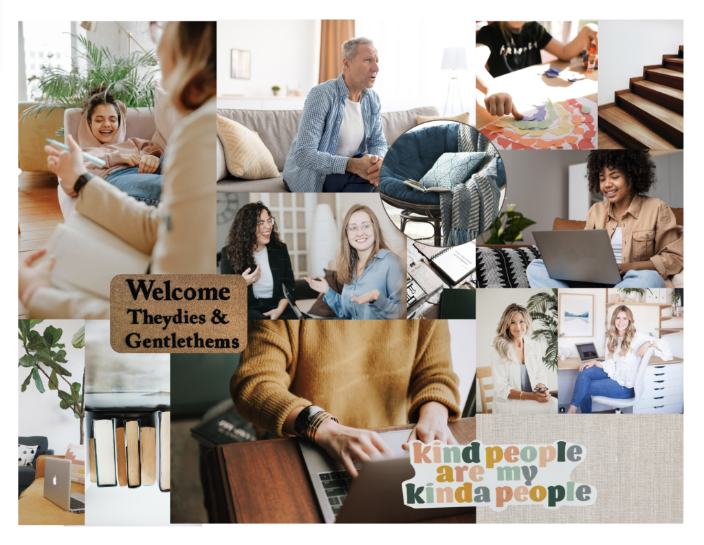
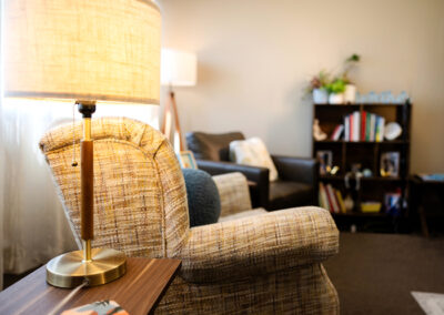
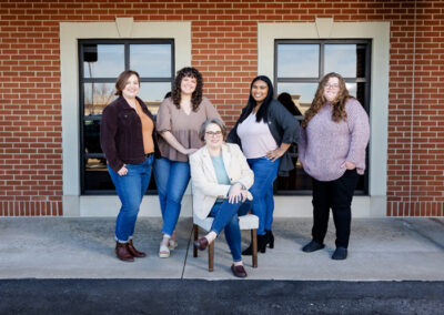
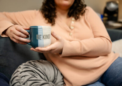
We collaborated with Sarah Jane Photography to creating a comprehensive library of curated story-telling branded photography. Our team crafted a desired shot list for Sarah to use as inspiration while shooting on-site. We knew we wanted to showcase the friendly atmosphere and relaxing meeting spaces Better Together Mental Health offers for their therapy clients.
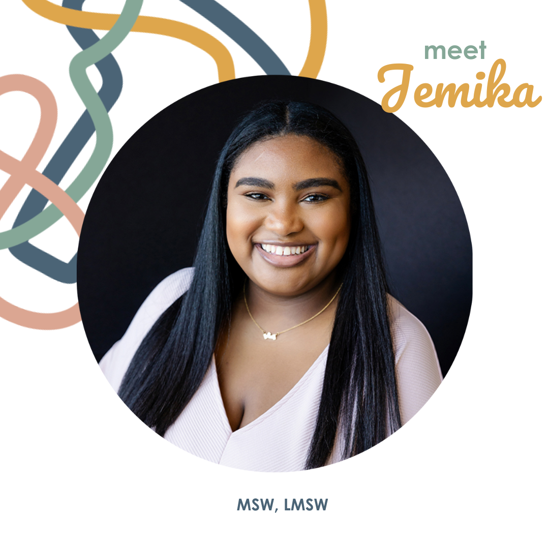
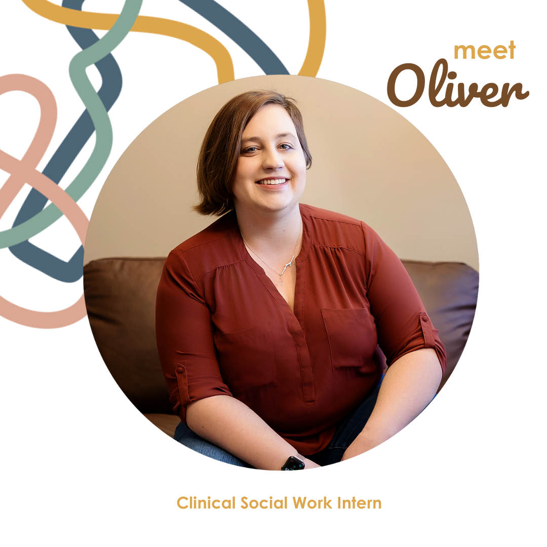
The final images were perfect! A mix of different backgrounds, poses, and “b-roll” shots showcase the demeanor and personality of each therapist as well as create a comprehensive cohesive look for the therapy practice located in Columbia, Missouri. As the team grows, it will be easy to add new headshots without the need to perfectly replicate the original lighting and background, making it easy to keep the story-telling cohesive without feeling stagnant as the business continues to evolve.
Building a Better [Together] Website
In the website refresh for Better Together Mental Health, we implemented several new pages to comprehensively describe and elaborate on the range of services offered by the private pay therapy office. These new pages were written to provide in-depth insights into the various therapeutic modalities, treatment approaches, and counseling services available to clients. We honed the information targeting their ideal clients, ensuring that the content resonated deeply with individuals seeking professional and compassionate mental health support from social workers (the unique value of this team). By refining the website’s structure and content, we aimed to create a more intuitive and engaging user experience while effectively communicating the practice’s commitment to providing personalized and effective therapy solutions.
