Brand Identity Redesign for a Nonprofit Arts Organization
The Missouri Symphony
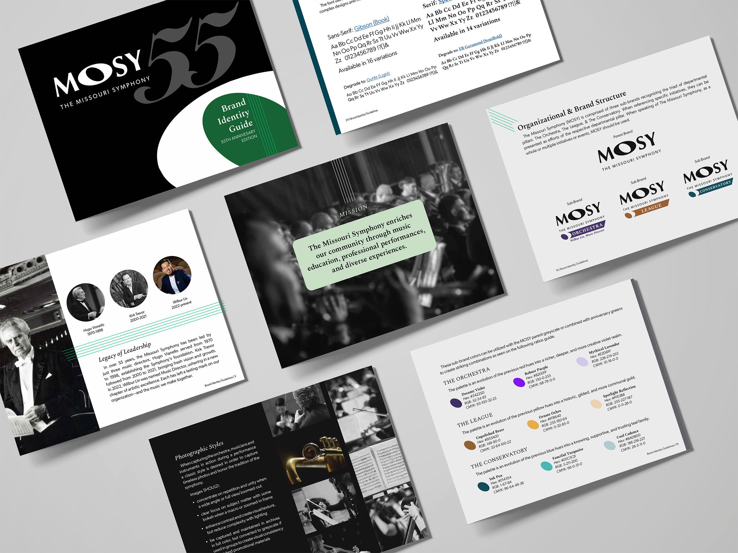
Director Trent Rash and the Missouri Symphony team partnered with Neat + Nimble for a brand identity redesign for their nonprofit arts organization as they prepared to move beyond their 55th anniversary. Their goal was to modernize the visual brand, honor their rich legacy, and invite a new generation of orchestra lovers to experience the magic of live performance.
Over the years, MOSY’s materials had evolved without a clear visual hierarchy or consistent color story. The brand leaned heavily on bright primary colors, making it difficult to maintain cohesion across the orchestra, league, and conservatory sub-brands. As one of Missouri’s leading cultural nonprofits, MOSY needed a refreshed, unified identity that could scale across programs and platforms—something both timeless and contemporary.
Solutions
Logo Development and Brand Identity Guide
Services
- Graphic Design
- Copywriting

Our Approach to a Historic Brand Identity Refresh
Marie guided a small internal committee through a thoughtful creative process, balancing artistic tradition with modern design principles. The Neat + Nimble team audited existing materials, clarified brand architecture, and explored color psychology to establish a strong visual foundation for the brand identity redesign for the nonprofit arts organization.
The result was a cohesive system that empowers their on-staff designer to apply the updated direction confidently across every touchpoint—from digital channels to printed concert programs.
Transformation Highlights:
-
Brand audit and visual hierarchy assessment
-
Color psychology and accessibility chart
-
Updated brand palette and typography system
-
Comprehensive brand identity guide (digital + printed)
- Clear sub-brand color distinctions for Orchestra, League, and Conservatory
The Outcome
The updated Missouri Symphony identity introduces a refined parent palette of greys, blacks, and whites, grounded by a signature emerald green that feels elevated and enduring. Each sub-brand was assigned its own complementary accent color, allowing for flexibility while maintaining overall cohesion.
This brand identity redesign for a nonprofit arts organization revitalized MOSY’s visual presence and positioned them for the next era of growth—bridging generations of music lovers with a look as timeless as their sound.


