Branding, Collateral, Print Advertising & Direct Mail
Missouri LAGERS
With a small internal marketing team and a membership base of over 36,000 with over 850 employers, it’s no wonder the Missouri Local Government Employees Retirement System (LAGERS for short) could use some help.
We started by working on a few quarterly membership magazines and were soon entrusted with key collateral used at the state capital, updating the brand identity system, developing new logos for events and trainings, as well as collateral crafted to convey the ultimate decision: “When should I retire?”.
Solutions
Brand Identity Refresh
Logo Development
Print Ads
Quarterly Membership Magazines
Seminar Booklet
Leave-Behind Folder
Letterhead & Business Card Templates
Email Signatures & Zoom Backgrounds
Powerpoint Presentation Template
Services
- Branding & Identity
- Graphic Design
- Copy Editing
- Digital Collateral
- Print Collateral
- Out of Home Advertising
- Print Management
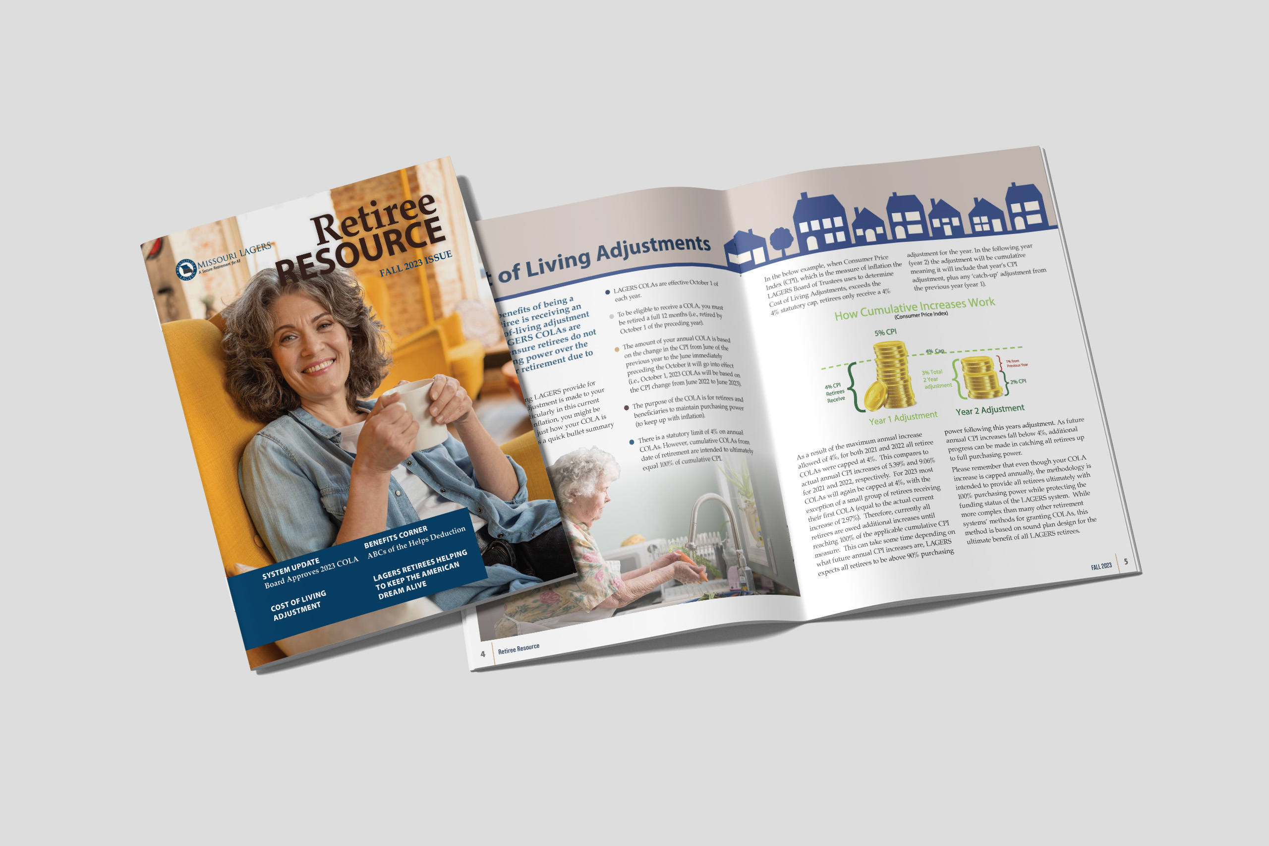
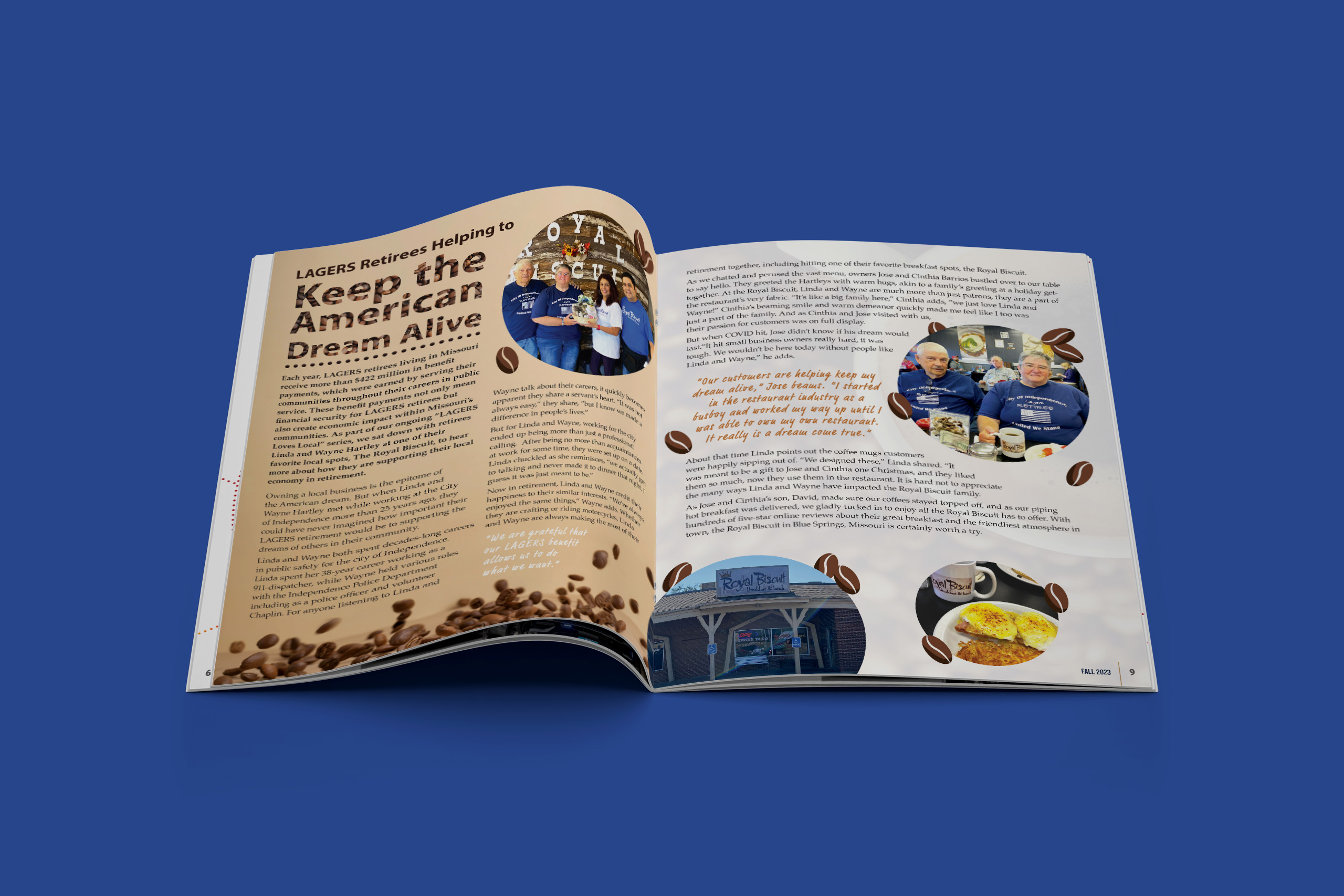
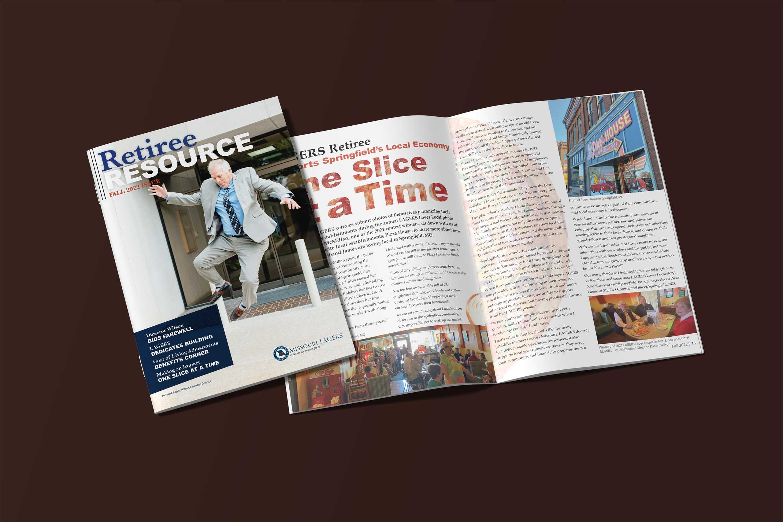
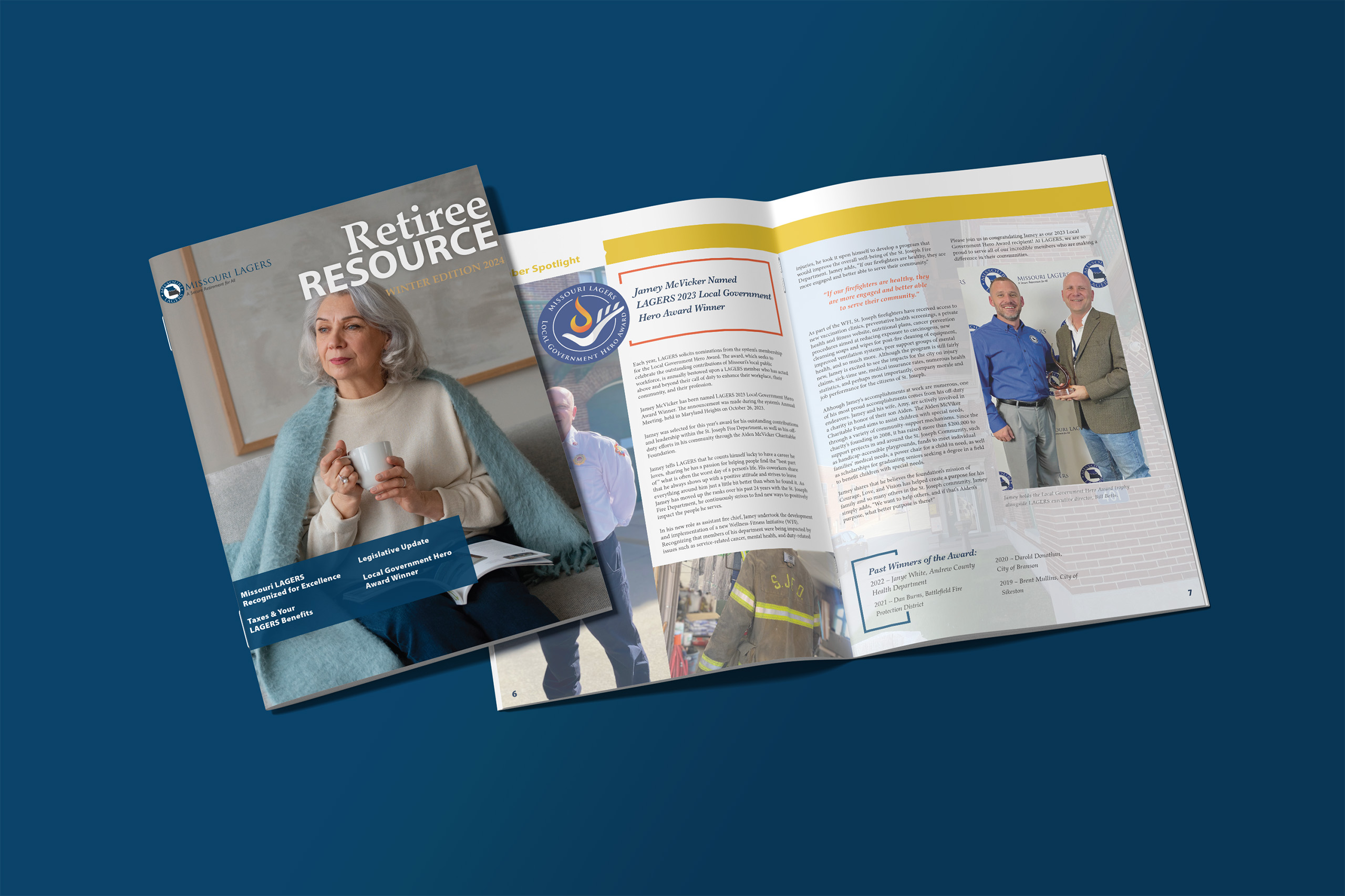
Retiree Resource, The Official Member Magazine
Even in today’s highly digital world, people often have a preference to hold a physical printed magazine and flip through the pages, seeing bright photography and feeling the slick pages. The member magazine features stories about fellow retirees and beneficiaries across the state as well as important updates about the financial system supporting their benefits. The magazine is mailed directly to members’ homes quarterly.
Brand Identity Refresh
We worked with the existing brand identity and refreshed the brand standards style guide in 2024. Our work involved updating the color palette to ensure a modern and cohesive look across all platforms. We refined the rules for major communications, establishing updated standards for both photography and illustration styles that resonate with their mission. Additionally, we refreshed their voice and tone to better reflect their values and the community they serve. The result is a unified and vibrant brand identity that authentically represents Missouri LAGERS and their commitment to excellence. The decisions made were compiled into a guide used throughout the organization and across departments, ensuring consistency at every level of communication.
Updated letterhead business card templates were created to fit the new standards along with Zoom backgrounds and email signatures for individual use.


Local Government Hero Award Logo
We had the honor of developing the custom logo for the Missouri Local Government Retirement System’s Local Hero Award. This design beautifully encapsulates the essence of the award and the everyday heroes it celebrates. The five “fingers” of the hand holding the flame represent the core areas where LAGERS’ members serve—keeping communities thriving and safe. The hand, reminiscent of an oil lamp or torch, symbolizes the enduring light of public service. Our goal was to create a logo that not only honors the exceptional contributions of these individuals but also reflects the humility many of them feel, despite their heroic impact.
Strategic Plan Logo
Under new leadership, the Missouri LAGERS also took on the responsibility of updating their strategic plan. The new campaign called for an identity and brand the internal team could feel inspired by and their members would have confidence in.
This new sub-brand encapsulates the essence of the concept of “Our Drive to Be More”. The five highway into sunset represents the journey of improvement as well as the community served nearing or enjoying retirement. The sun is a beacon of hope, insight, and positivity on the horizon. Our goal was to create a logo that not only honors the difficulties ahead, but also the contributions and solutions already in process.
Certified LAGERS Administrator Logo
The Missouri LAGERS Certified LAGERS Administrator (CLA) logo represents a mark of distinction and expertise for those who have successfully completed the LAGERS Administrator Certification Training. This emblem is a visual testament to the recipient’s deep understanding of the LAGERS system, showcasing their commitment to excellence in public service administration.
Featuring a design that integrates the core elements of Missouri LAGERS’ brand, the CLA logo serves as a badge of honor for administrators who have demonstrated their proficiency and are now equipped to lead with confidence, knowledge, and a clear understanding of how to effectively manage retirement benefits for their organizations.
Build Your Brand
Find out how we can help during a free discovery call with our team.