We are surrounded by design. Whether we recognize it or not, we deal with design on a regular basis. From the cover of your favorite book to the labels sitting in your pantry. Everything you touch that is man-made has been designed.
What constitutes good design? Design can be as subjective as art in a museum gallery in terms of aesthetics, but appearances aren’t everything. Yes, beauty attracts attention and can keep it, but design’s primary goal is to provide a function, solve an issue, or both.
The guidelines that a designer must follow in order to create an effective and appealing composition are known as the design principles. The fundamental principles of design are as follows: Emphasis, Balance, Scale, Contrast, Pattern, Movement/Rhythm, and Unity. In this blog post, we’ll take a look at all 7 principles, and show you examples of some do’s and don’ts.
1. Emphasis
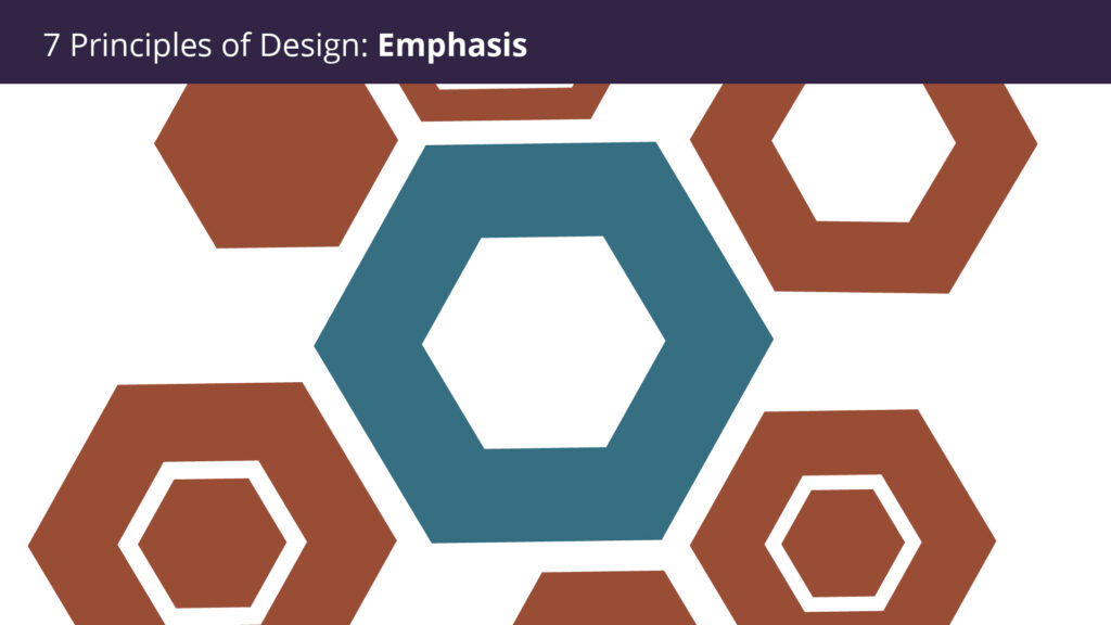
The first of the seven design principles is focus, which refers to a design’s focal point and the importance of each element within it. Assume you’re designing a concert poster. What is the most important piece of information that my audience needs to know? Is it the group? Or how about the concert venue? What about the time and expense of the event?
Create a mental map. Allow your brain to organize the information before laying up your design in a way that conveys that order.
2. Balance
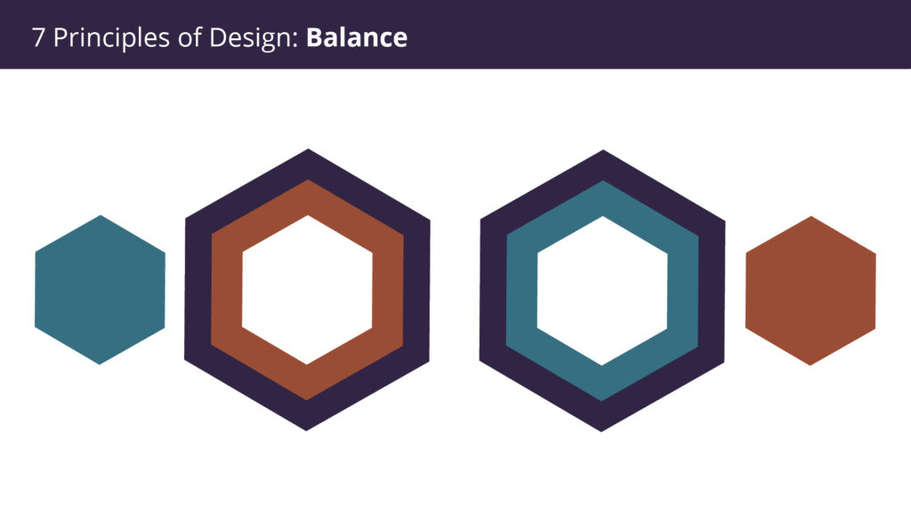
Balance is how the elements within a composition are arranged either symmetrically, asymmetrically, or radially to create the impression of equality in weight or importance. Color, size, and texture can all contribute to weight. You can’t cram all your weighty elements into one section of your composition, just like you wouldn’t place all your furniture in one corner of a home. Your audience will feel as if their eye is sliding off the page if there is no balance.
3. Scale
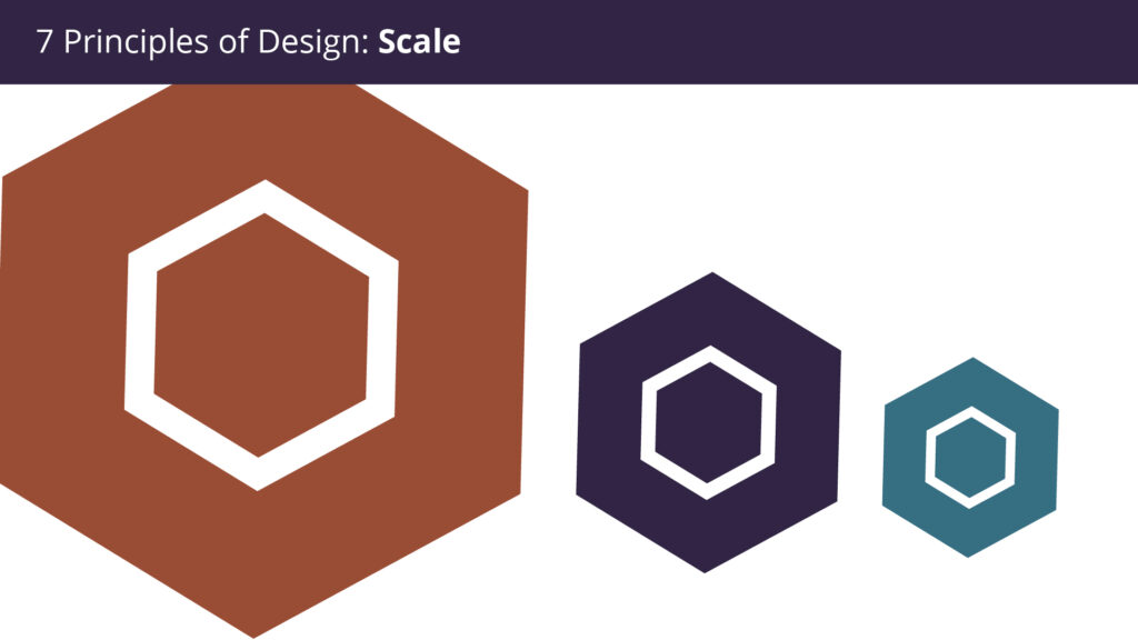
Scale is how big or small something is. The proportion of something is affected by its scale. In design, the phrase “bigger is always better” is not necessarily true. Small details can sometimes draw attention just as efficiently as larger ones. It’s the message you want to send through the design.
4. Contrast
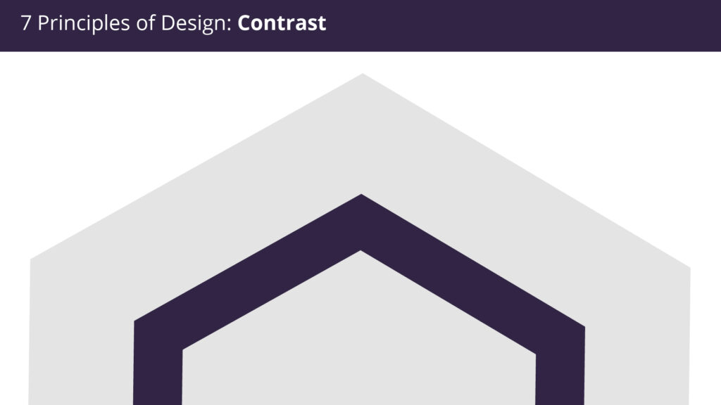
When someone says a design “pops,” they’re referring to contrast. It jumps off the page and lodges itself in your mind. Contrast in your design generates space and distinction between elements. To operate effectively together and be viewable, your background should be significantly different from the color of your pieces.
Understanding contrast is crucial if you want to work with type since it implies your type’s weight and size are balanced. If everything is in bold, how will your readers determine what is most important?
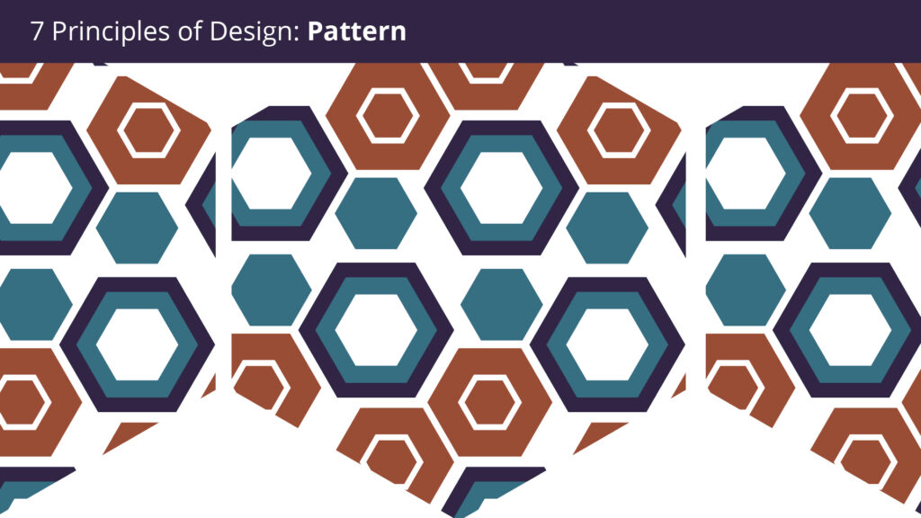
5. Pattern
The repeating of specific visual components, such as a single unit or a myriad of forms, is known as pattern. Patterns can be utilized to produce harmony, to organize surfaces in a regular fashion, or to add contrast. Department store floor tiles are an example of this. While they are decorative, they also have another purpose: they guide customers around the business.
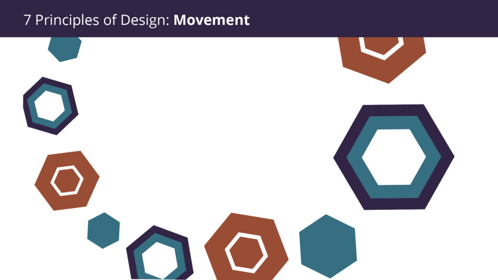
6. Movement/Rhythm
Movement is controlling the elements in a composition so that the eye is led to move from one to the next and the information is properly communicated to your audience. The tale or narrative of your work is created by movement: a band is performing, it’s at this location, at this time, and here’s how to acquire tickets. The aspects listed above—particularly balance, alignment, and contrast—can help you achieve that aim, but your design will be pointless without adequate movement.
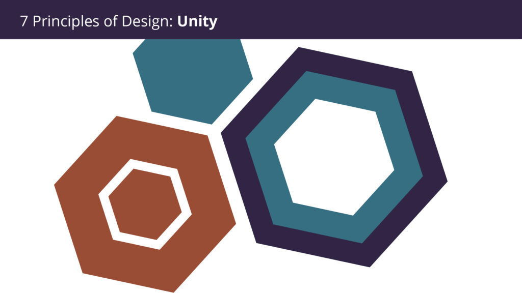
7. Unity
What happens when you combine everything? What is the relationship between all of these elements? Unity is created by the way elements are placed so that the image is regarded as a whole and overall.
So there you have it: the 7 fundamental principles of design. As you may have noticed, all seven principles function in harmony with one another. The overall proportion is affected when the scale is changed. You can generate focus by playing with contrast. When you touch anything really, it can disrupt the entire unity. And so on. Design is the marriage of function and form!
Are you interested in learning more about the principles of design? Then we have something just for you! Join us at our Lean + Launch Bootcamp, where we will dive deeper into the seven principles of design. Not only will you get a better understanding of these 7 principles, but you will also get to apply them in hand-on projects for later use!